How Uber designed around the uncertainty of getting somewhere.
An independent study of how pricing, maps, scheduling, safety features and behavioural design make an unpredictable journey feel more manageable.
Product
Uber rider app · The rider journey, from destination to receipt
Organisation
Uber
Method
Independent desk research: Uber announcements, help pages and published research, plus academic studies
Published
Sources checked
Reading time
20 min · 4,493 words
Independent research and analysis by WholeArc. Not affiliated with or endorsed by Uber.
Photo: Stock Catalog, CC BY 2.0, via Wikimedia Commons. Illustrative; not an Uber screenshot.Original WholeArc diagramThe eight stages of the rider journey this study follows. Conceptual, not measured data.
Executive summary
It's 5:10 on a dark morning and your flight leaves at 7. All that stands between you and the airport is a car you haven't seen yet. This study follows that one trip, moment by moment, and asks how an app made it feel manageable.
Getting a ride is an exercise in uncertainty. Will a car come? What will it cost? Where exactly will it stop? Uber's rider app turns those questions into a sequence of visible steps: a destination, a price, a car moving on a map, a countdown, a receipt. This study follows that sequence through eight stages of the journey, using Uber's announcements, help pages and published research alongside independent studies.
A price replaced a formula. In 2016 upfront fares replaced surge multipliers with a single amount1. That amount can still change if the trip changes2.
Explaining the wait changed behaviour. Uber reports that showing riders what was happening during matching cut post-request cancellations for one shared-ride product by 11 percent7.
Booking ahead moved the uncertainty earlier, not away. Scheduled Rides in 2016 set a time but sent the request near pickup15. Reserve lets a driver accept in advance "when possible"20, and Uber says it doesn't guarantee one will19.
Safety tools are well documented; their outcomes aren't. Uber describes what each feature does, but the sources we read report usage and perception, not measured safety results29.
The weakest point is physical. The app is strongest where it can show the system's state, and weakest where a kerb, an entrance or traffic refuses to match the map.
WholeArc verdict
Uber made the uncertainty of finding a ride easier to manage. It didn't remove the uncertainty of the ride itself.
How to read this study: Fact sourced and checkable · Observation visible in the product or its documentation · Interpretation WholeArc's reading · Hypothesis an idea that would need testing. Numbers link to the sources.
The short scenes in italics follow one imagined trip. They're there to make each moment concrete; they aren't research findings. Everything around them is sourced.
02Before the app, waiting came without information.
Ten years earlier, the same morning looks different. You booked a cab by phone the night before and someone wrote your address on a pad. Now it's 5:10, you're at the window watching for headlights, and there's no way to know whether a car is on its way.
Getting a car used to mean one of two things: stand on a street and look for a free taxi, or call a dispatcher and hope. Economists Judd Cramer and Alan Krueger, comparing taxis with UberX in 2016, describe taxis as relying on "a two-way radio dispatch system developed in the 1940s or sight-based street hailing"37.
The problem wasn't only how long you waited. It was how little you knew while waiting. In a survey of San Francisco riders published in 2016, only 35 percent said they usually waited less than ten minutes for a taxi called to their home on a weekday daytime, and 16 percent at night or at weekends. Close to 90 percent of ride-hailing users said they waited ten minutes or less38. Those are self-reported numbers from one city, and the authors flag possible recall bias, but the pattern matches a much older observation. In his 1985 essay on waiting lines, David Maister uses a phone call for a taxi as his example of an unexplained wait, and argues that uncertain waits feel longer than known, finite ones11.
That isn't true of every taxi service, then or now. Plenty of cities had reliable dispatch, and street hailing in dense centres can be fast. What changed with ride-hailing apps was where the information sat. Uber was founded in 2009, incorporated as Ubercab in July 2010 and launched in the United States that year39. Its rider app put the state of the trip, which had lived with dispatchers and drivers, onto the rider's screen.
It's 5:10 and you open the app instead. Before you've typed a thing, “Airport” is sitting near the top of the list. You tap it.
Uber's November 2016 redesign made the destination the first thing the app asks for. Uber said frequent riders would see "shortcuts" that "predict where you could be headed"3. The 2023 redesign extended the idea: after tapping "Where to?", riders see their Saved Places and "a list of personalized destinations and ride types based on your preferences, past trips, and most likely destinations"4. In April 2026 Uber went further, redesigning the bar so that "a single search populates results for places, food and items" across its services44.
See the interfaceUber's February 2023 announcement includes images of the redesigned home screen and lock-screen trip tracking. View them on Uber's newsroom →
InterpretationTyping an address is a small act of recall at a moment when people are often busy: leaving a building, juggling bags, checking the time. Showing likely destinations turns that into recognition, which Jakob Nielsen's heuristics describe as minimising "the user's memory load by making elements, actions, and options visible"12. For a repeated trip, such as home, work or the station, the right suggestion removes a step entirely.
Prediction has a cost when it's wrong. A suggestion near the top of the list is easy to tap by mistake, and a destination screen that also searches food and shopping asks the rider to filter more possibilities at the moment they want one answer.
HypothesisRiders would trust personalised suggestions more if they could see why a place was suggested and remove it in one step. We haven't tested what controls Uber offers today, so this is a direction to explore, not a gap we've measured.
04A price replaced a multiplier, and changed what “upfront” means.
Three options appear, each with a price and a time. One's cheaper but slower. You pick the middle one, and the number on the button is the number you expect to pay.
Until 2016, busy periods were communicated as a multiplier. Uber's India newsroom put the change plainly: "instead of seeing that a fare will cost 1.5x, you will see that the trip will cost ₹100", and "instead of surge lightning bolts and pop-up screens, riders are given the actual fare before they request"1. Uber said it had begun introducing upfront fares for uberX in US cities that April1. The redesigned app in November 2016 then made it "much easier to compare the cost of all your options", and for uberPOOL and uberX showed "what time we expect you to arrive"3.
InterpretationA multiplier asks the rider to do arithmetic on a number they can't see. "1.5x" of what? A single amount answers the question people actually have, which is whether this trip is worth it at this price. Showing price and arrival time side by side also makes the real trade-off visible: pay more to leave sooner, or less to wait.
Original WholeArc diagramThe words around a ride carry different promises. Based on Uber's published terms2,20.
"Upfront" doesn't mean fixed. Uber's current help page says an upfront price "may change due to a number of circumstances, which may include adding stops, updating your destination, significant changes to the route or duration of the trip, or you pass through a toll that was not factored into your upfront price", and that riders "may incur wait time fees"2. If the price isn't honoured, the rider is charged a minimum price or one based on measured time and distance2. Cancellation has its own conditions. For economy rides, a fee can apply if the rider cancels more than two minutes after a driver accepts, or if the driver waits at least seven minutes at pickup, and Uber says fees "vary by location"6.
Uber has since added ways to trade time or money explicitly. In India, Wait & Save lets riders "pay less if you're willing to wait a little longer" and was live in more than ten cities by July 20255. In the US, a Price Lock Pass announced in May 2025 costs $2.99 a month and "protects your fare on a selected route for a one-hour window"43.
What this means
The price before you ride is a quote with conditions, not a guarantee. The interface is clearest when it shows the number. It's least clear when riders have to look elsewhere to learn what can change it.
05Explaining the wait kept people waiting.
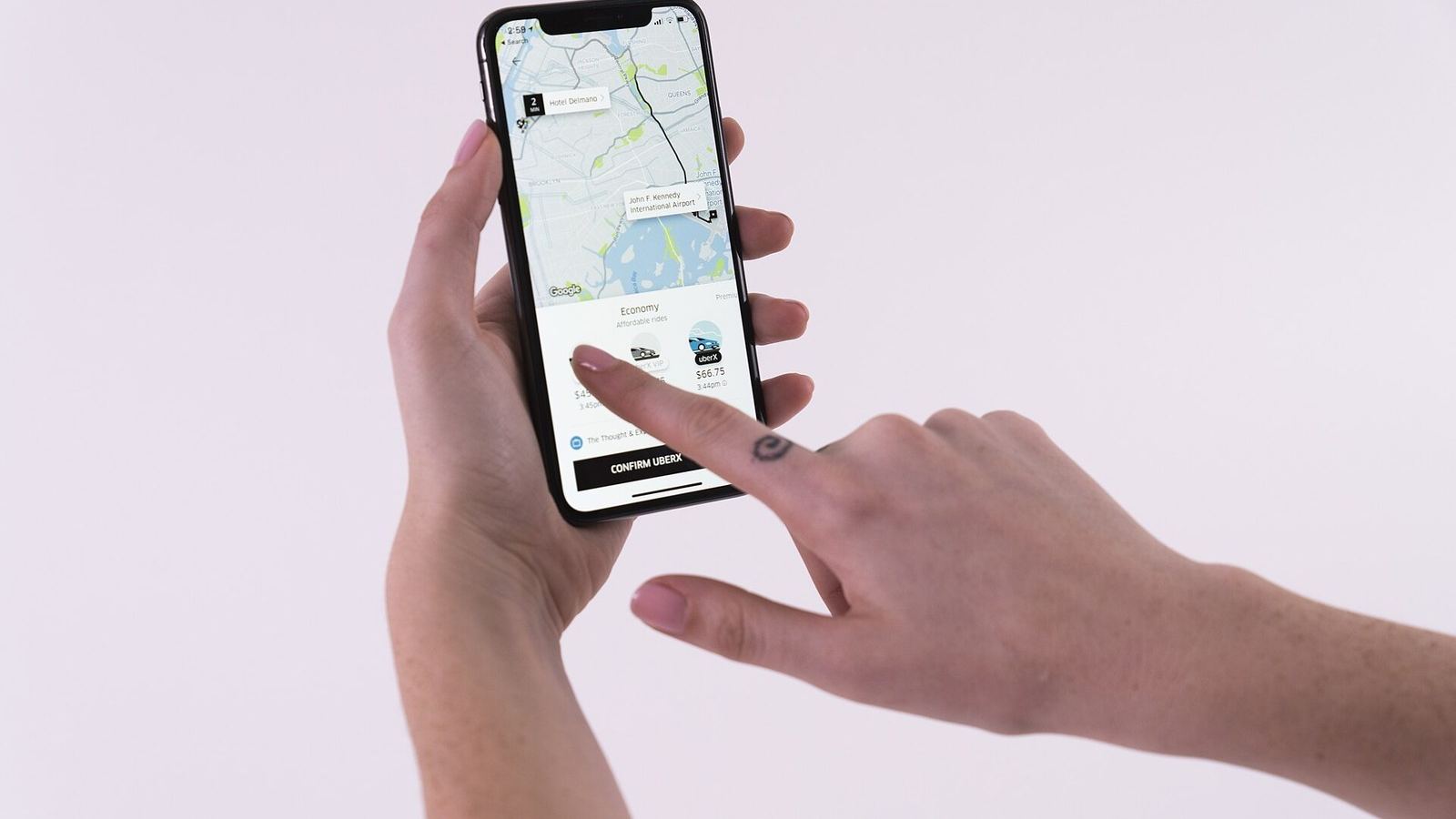
Photo: Wilfredor, CC0, via Wikimedia Commons. Illustrative; not an Uber screenshot.
You tap Request. For a few seconds nothing is decided. Then a name, a photo, a grey saloon, and a small car crawling towards you on the map. Four minutes.
The most useful evidence in this study comes from Uber itself. In early 2018 Uber launched Express POOL, a cheaper shared ride that "includes extra wait time between requesting and matching with a car and a short walk to their pick-up location"7,42. According to Uber's behavioural science team, riders "were cancelling their trips in the time between request and matching... at a high rate relative to other products"7.
The team recommended "highlighting progress during wait times by explaining each granular step going on behind the scenes, like identifying other riders traveling the same way and finding a car for the trip", with an info icon explaining how the arrival estimate was calculated. In an A/B test, the Express POOL team "observed an 11 percent reduction in the post-request cancellation rate"7.
FactThat's what Uber reported. The post doesn't say whether the reduction is relative or absolute, and doesn't give a baseline rate, sample size, duration or markets. It doesn't say whether the design shipped to everyone. It describes one shared-ride product, so it shouldn't be read as a result for all Uber rides.
Uber's post named three ideas behind the design. Idleness aversion: "people dread idleness and want to be busy"7, from Hsee, Yang and Wang's experiments9. Operational transparency: "revealing to consumers what is going on under the hood", which Buell and Norton found can make people value a service more, even when it takes longer8. And the goal-gradient effect: people try harder as they feel closer to a goal10.
Original WholeArc diagramThe same wait, told two ways. The steps on the right are our wording, loosely based on the steps Uber described for its Express POOL test7. Conceptual, not measured.
ObservationOnce a driver accepts, Uber shows the driver's photo, the vehicle's make, model and licence plate23, and the car's approach on a map. Nielsen's first heuristic, visibility of system status, asks designs to "always keep users informed about what is going on, through appropriate feedback within a reasonable amount of time"12.
InterpretationA moving car and a countdown turn waiting into something you can watch. The risk is that an estimate starts to look like a promise. When the countdown jumps from three minutes to nine, the rider learns that the number was a guess, and may trust the next one less.
HypothesisShowing a range rather than a single minute, when traffic or matching is unpredictable, might set expectations more honestly. It might also feel less precise and reduce confidence. Only testing would tell.
06Booking ahead moved the worry, but didn't remove it.
Or perhaps you booked this ride last night, so you wouldn't have to think about it at 5 a.m. Whether that let you sleep depends on which feature you used, and what it actually promised.
Getting a ride now is one kind of uncertainty. Depending on a ride tomorrow at 4:30 a.m. is another. Uber's answer has changed more than its name.
2016: Scheduled Rides set a time, not a driver
Uber began rolling out Scheduled Rides on 9 June 2016, starting in Seattle, letting riders book "15 minutes to 30 days in advance"13. Uber described "the comfort of knowing your Uber will be there when it's time to head out"13, but the product didn't match a driver ahead of time. Fortune reported that "Uber doesn't match a rider with a driver ahead of time" and instead requests a car "a little bit before" the scheduled time14. Uber's India announcement described the mechanism directly: the app "constantly monitors the ETA; and when it's time to request, it dispatches to closest Uber driver"15. Uber's current help page is explicit: "Scheduling a ride in advance doesn't guarantee you'll be connected with a driver"16.
2020 onwards: Reserve brought drivers in earlier
Uber Reserve launched in the US in November 2020. TechCrunch reported that riders would "be matched to a driver ahead of the trip", starting with premium rides17. In October 2021 Uber added airport reservations that adjust to flight information, with the driver waiting "up to 60 minutes at no additional charge" for those premium airport trips18. Today's US terms say that "when possible, a driver will accept your request before the pickup time", that riders can cancel at no charge up to an hour before, and that the price includes a reservation fee20. The US product page lets riders book up to 90 days ahead, and also says: "Uber doesn't guarantee that a driver will accept your ride request"19.
Original WholeArc diagramWhen the uncertainty resolves. Timings vary by market and product; see Uber's terms16,20.
InterpretationScheduling shortens the period of uncertainty without ending it. With a 2016-style scheduled ride, the question "will there be a car?" stays open until minutes before pickup. With Reserve, it can close much earlier, once a driver accepts and their details appear, but Uber's own wording leaves room for it to stay open. The interface works best when it says plainly which state you're in: booked, waiting for a driver, or confirmed.
Photo: Raysonho, CC0, via Wikimedia Commons. Illustrative; not an Uber screenshot.
The car is outside. Or it's round the corner, at the address the pin chose. You're both looking at the same map and still can't find each other.
The map is precise; the street isn't. A pin can sit on the right building and the wrong side of it. Uber's help pages describe the app recommending "a nearby Pickup spot or multiple Quick pickup points", shown as dots on the map21. At some airports Uber has used a PIN system instead: riders join a queue of waiting drivers and give a code to the first available car. It was first piloted at Portland in 201922.
Once a driver is on the way, the app shows "a photo of your driver" and "the vehicle's make, model, and license plate number"23. Uber says it "has always provided" these details and added "Check Your Ride" reminders in 201924.
Original WholeArc diagramWhat the app can show, and what it can only describe. Conceptual.
InterpretationPickup is a coordination problem between two people who can't see each other yet. Psychologists Herbert Clark and Susan Brennan call the work of building shared understanding "grounding"45. Suggested pickup points give both people the same reference. A licence plate gives the rider something to check that the driver can't change. A pin on a large building gives neither person enough, which is why riders end up calling.
HypothesisLarge venues, stations and campuses would benefit from named, pre-agreed meeting points that both apps show the same way, rather than coordinates. We haven't tested how riders currently resolve these moments.
It's dark, and you're getting into a stranger's car. You check the plate against the app. Somewhere in a menu are tools you've never opened.
Uber's safety tools have been added in layers. In April 2018 Uber launched a Safety Toolkit and in-app emergency button for riders, then live in the US, Canada, India and parts of Latin America. That September it described a 911 integration pilot that automatically shares location and vehicle details with dispatchers, and introduced RideCheck, which checks in "in the event of a possible crash"26. RideCheck became available to all US riders and drivers in September 201927.
PIN verification gives riders a four-digit code to tell the driver; a trip "cannot start until the correct PIN is entered", and riders can use it on every trip or only at night24. Uber launched RideCheck and PIN verification in India in January 2020 and announced an audio-recording pilot there25. In April 2024 it added safety preferences, which switch chosen features on automatically, for example for "trips after 9pm", and described how audio recordings work: "no one—not the driver, not Uber, nor you—has access to it" unless it's shared with a safety report28. In India, Uber introduced audio recording and Women Rider Preference in November 2024, along with an SOS integration then live in Telangana29.
See the interfaceUber's January 2020 India announcement includes images of RideCheck, audio recording and PIN verification. View them on Uber's newsroom →
FactThe posts we read describe what each feature does. The numbers they contain are usage figures and perception surveys reported by Uber. None reports a measured reduction in safety incidents. A feature can be well designed and still not tell us anything about outcomes.
InterpretationSafety tools are used rarely and under stress, when attention narrows. That makes two things matter more than the feature list: whether people know the tools exist before they need them, and whether they can be used with one hand, in a moving car, without reading much. Safety preferences are a sensible response, because they move the decision to a calm moment.
HypothesisA short, skippable safety walkthrough at the start of a rider's first late-night trip might improve discoverability more than another menu item. We have no data on how often riders find these tools today.
Later in the week you open the app again, and there are more choices than you remember: shared, larger, cheaper if you'll wait.
The list of options has grown steadily. UberX arrived in New York in July 2012 as a cheaper alternative to black cars40. uberPOOL opened in San Francisco in 2014, promising to cut costs "by up to 40%"41, and Express POOL followed in 201842. The 2023 redesign added a Services tab for everything beyond a standard ride4. In India in 2025 the list included Wait & Save, Uber XL Plus, Uber Pet, Courier XL and metro tickets, each in specific cities5. In the US, Route Share offers fixed-route shared trips "up to 50% cheaper" than UberX43, and wheelchair-accessible vehicles are "only available in select markets"32.
InterpretationMore options make it likelier that one fits, and harder to choose. The comparison screen helps by putting price and arrival time side by side, so the choice becomes a trade-off rather than a catalogue. The default selection does a lot of work here: most riders will take whatever is pre-selected if it looks reasonable.
Almost every option is market-specific. A feature announced in one country may not exist in another, and any study of "the Uber app" is really a study of one version, in one place, at one time.
Your neighbour wants to book her own rides to the clinic. The standard screen asks her to read small labels and make several choices before a car is even on its way.
In June 2025 Uber launched senior accounts and Simple mode across the US: "larger text, fewer buttons, and easy-to-follow screens", with Simple mode available from the Account section and no family profile required30. Uber said both would come to other countries, with India getting Simple mode30. Separately, Uber says its apps work with VoiceOver and TalkBack, and that riders with a disability can ask for wait-time fees to be refunded or waived31. Wheelchair-accessible rides use drivers who have completed a third-party certification course32.
InterpretationThese address different needs. Larger text helps people who find the standard screen hard to read. Fewer choices help people who find the decisions hard to make. Screen-reader support helps people who can't see the screen at all, and fee waivers acknowledge that some riders need longer to reach the car. Treating "accessible" as one setting would miss most of this.
11During the ride, the screen keeps the trip legible.
On the motorway you glance at your lock screen instead of opening the app: twenty-two minutes to the terminal.
Once the car is moving, the rider's question changes from "is it coming?" to "are we nearly there?". The 2023 redesign brought trip progress to the iPhone lock screen through Live Activities and the Dynamic Island4. Riders can share their live location and trip details with a friend or family member28, and RideCheck is designed to notice when a trip goes unusually, such as a possible crash26.
InterpretationThe lock-screen view matters because it lets riders check progress without opening the app, which is what people do in a car. The weak point is change. If the destination is updated or the route changes significantly, the price can change too2, and that consequence isn't necessarily obvious at the moment of the change.
12After the trip, closure depends on what goes wrong.
Photo: Eric Pires, CC0, via Wikimedia Commons. Illustrative; not an Uber screenshot.
At the terminal the ride ends, and the receipt arrives before you reach the doors. Unless you left your charger on the back seat.
When a trip ends, a receipt is emailed and the trip history is updated "with details about the route and fare"36. Riders have 30 days to add a tip, and tipping "is not required"35. Riders and drivers rate each other from one to five stars, and "neither riders nor drivers will see the individual rating"33. For a lost item, the app routes the rider to contact the driver, and a return fee that varies by region is passed to the driver34.
We couldn't find a current Uber help article describing how riders dispute a fare, so we haven't described that flow.
InterpretationFor an ordinary trip, the receipt is the ending: a clear amount, a route, done. Closure is harder when something goes wrong, because the rider moves from a live, visible system to a support process that is slower and less transparent. Some questions can only be answered by talking to riders and drivers. Do people understand why a final price differed from the quote? How do drivers feel about ratings? What happens to trust after a dispute?
How the app got here.
Dates come from Uber's announcements and press coverage. Features launched market by market, so a date marks the first launch we could verify, not global availability.
Uber launches in the United States; the company was incorporated as Ubercab in July 2010. 39
UberX arrives in New York as a cheaper option than black cars. 40
uberPOOL is tested in San Francisco, then opened to Bay Area riders. 41
Upfront fares begin replacing surge multipliers, starting with uberX in US cities. 1
Scheduled Rides rolls out, starting in Seattle: book 15 minutes to 30 days ahead. 13
Redesigned app asks “Where to?” first and shows prices and arrival times for each option. 3
Safety Toolkit and in-app emergency button for riders. 26
Uber publishes its Express POOL waiting experiment. 7
RideCheck available to all US riders and drivers. 27
RideCheck and PIN verification launch in India. 25
Uber Reserve launches in the US, matching riders with a driver ahead of the trip. 17
Reserve at airports adjusts pickup to flight information. 18
App redesign: personalised home screen, Services tab, Activity hub, Live Activities. 4
Safety preferences switch chosen features on automatically. 28
Audio recording and Women Rider Preference launch in India. 29
Route Share and the Price Lock Pass announced in the US. 43
Senior accounts and Simple mode launch across the US. 30
Wait & Save live in more than ten Indian cities. 5
“Where to?” becomes a single search across places, food and items. 44
14What Uber does well.
It makes the system's state visible. From matching to arrival, there's almost always something on screen that answers "what's happening now?", and Uber's own test suggests explaining the wait changed behaviour7.
It shows a price instead of a formula. Replacing multipliers with an amount answered the question riders actually had1.
It favours recognition over recall. Saved places and predicted destinations cut typing at busy moments4.
It lets people plan. Scheduling and Reserve move part of the uncertainty to a calmer moment20.
It gives riders things to check. Driver photo, plate and optional PINs turn trust into verification23,24.
It removes repeated effort. Payment, receipts and trip history happen without the rider doing anything36.
15Where the experience could improve.
These are WholeArc's independent hypotheses, not measured problems. Each would need testing with riders.
HypothesisSeparate estimates from commitments. Use consistent language and visual treatment for what's an estimate (arrival time), a quote (upfront price) and a confirmation (a matched driver).
HypothesisExplain price changes at the moment they happen. When a stop or route change will alter the fare, say so before the rider confirms the change.
HypothesisName the meeting point, not just the pin. Shared, human-readable pickup points at large venues would give both people the same reference.
HypothesisTeach safety tools before they're needed. Prompt riders to set safety preferences at a calm moment, rather than relying on them finding a menu under stress.
HypothesisKeep choice manageable. As options grow, show a short default list with the rest one step away.
HypothesisGive riders control over prediction. Let them see and remove why a destination is suggested.
HypothesisMake post-trip support as legible as the trip. Show the status of a dispute or lost-item request the way the app shows a car on its way.
Lessons for product builders.
Each lesson links a documented decision to a behavioural explanation and a principle you can use.
Show the number people decide on.Uber replaced surge multipliers with an upfront amount1. A multiplier asks for arithmetic on a number nobody can see. When people are choosing, show the outcome, not the formula, and say plainly what could change it.
Narrate the wait.Explaining each step of Express POOL matching cut cancellations in Uber's test7, consistent with research on idleness aversion and operational transparency9,8. If people have to wait, show them the work being done.
Separate a plan from a promise.Scheduled Rides set a time; Reserve can secure a driver, but not always16,19. People depending on a future event need to know which state they're in: booked, matched or confirmed.
Make the next step recognisable.Saved places and predicted destinations turn recall into recognition4,12. Predict the likely answer, but make it easy to correct.
Design for the kerb, not the map.Suggested pickup points and plates give two strangers a shared reference21,23,45. When people have to meet, give them something both can see and name.
Let people set protections when they're calm.Safety preferences turn features on automatically for the situations riders choose28. Decisions made under stress are harder; move them to a calmer moment.
What this study can't tell you.
This is desk research. Here is what it can't tell you.
WholeArc has no access to Uber's internal research, data or design decisions. Where we describe why Uber made a choice, we quote Uber or label it as our interpretation.
We conducted no interviews, surveys or usability tests for this study. Everything here comes from published sources and Uber's own documentation.
Uber's product differs by country, city and app version. A feature described here may not exist where you are, or may have changed since we checked our sources on 14 October 2026.
Historical screens are hard to verify. We describe features from dated announcements rather than reproducing screenshots we couldn't date or license.
Much of the evidence is published by Uber. Company posts describe features favourably and report their own experiments without full methods; we've noted where details are missing.
Independent research on ride-hailing user experience is limited. The academic studies we cite are about waiting, transparency and communication in general, not about Uber's current app.